Automated Pricing Strategy Platform
TL;DR
I identified trust, not automation, as the core barrier to AI adoption in pricing. Through research with 15 pricing managers, I reshaped the product to make ML transparent and controllable.
Onboarding dropped from days to under 10 minutes. Core feature adoption grew ~25%.
I introduced design-dev pairing and a lightweight component system. Feature delivery accelerated from 3 weeks to 1.5 weeks. Team satisfaction jumped 30-50%.
Pricing managers stuck between two bad options
Manual spreadsheet workflows consumed hours of their time, couldn't scale with growing product catalogs, and required constant updates. Yet when they tried AI-powered pricing tools, they encountered a different problem: black-box algorithms they couldn't trust, understand, or control.
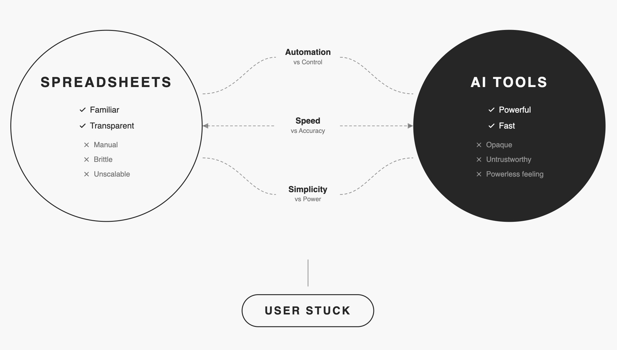
The market gap was clear: Existing solutions forced users to choose between transparency and automation. Priceloop needed to deliver both.
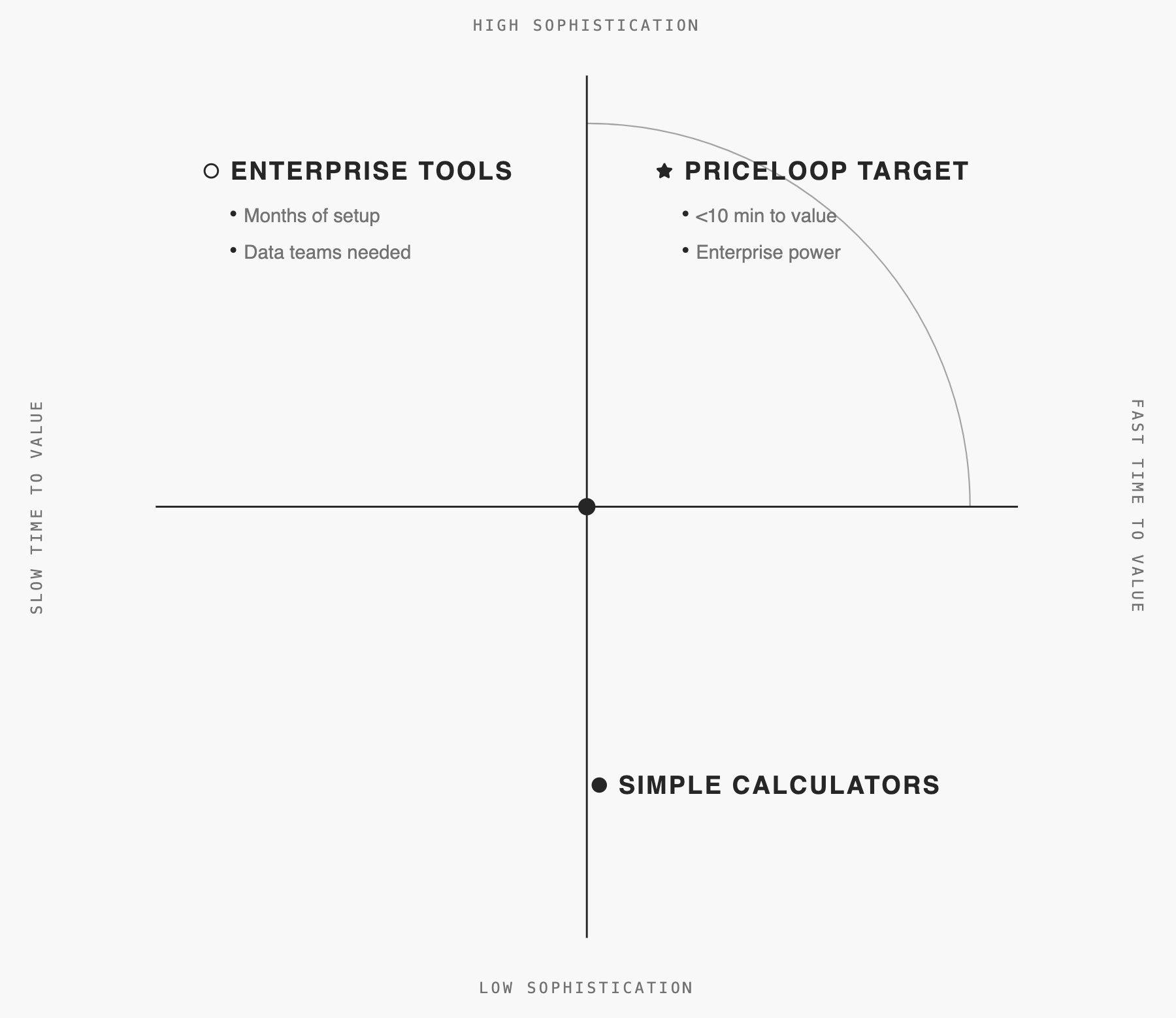
The market had enterprise tools (months of setup) and simple calculators (too basic for dynamic pricing). Nothing combined sophistication with speed.
Research uncovered the real barrier: Trust
I interviewed 15 pricing managers over 6 weeks. Initial assumptions pointed toward automation as the main value proposition.
Core finding: Users cared less about how algorithms worked and more about what they would do to their prices.
Before trusting any change, they needed:
Three tensions shaped our approach
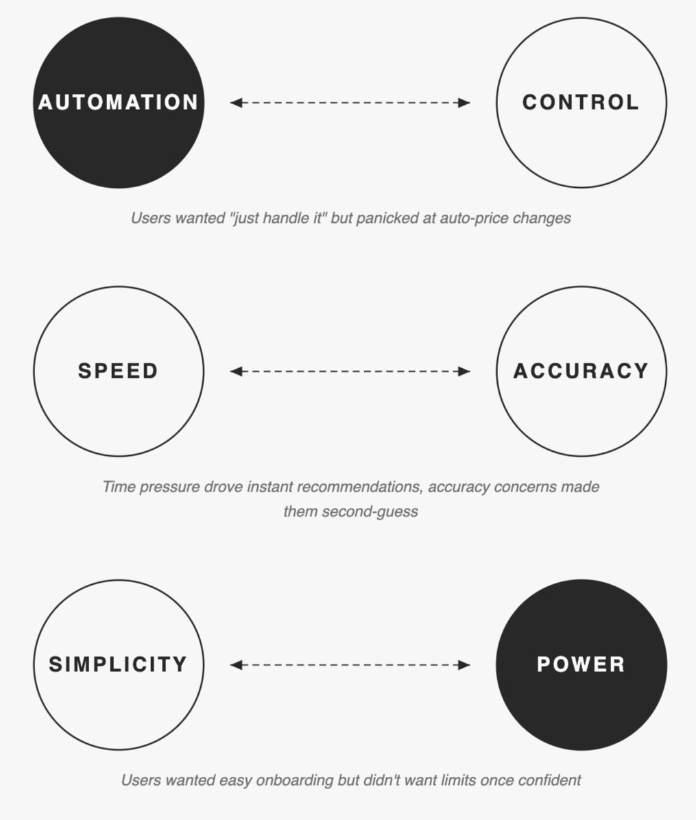
We couldn't resolve these. We designed for both ends.
Make ML Explainable and Controllable
The key strategic decision emerged early: don't build another "smart" black-box tool. Instead, make machine learning explainable and controllable.
For the first version, I intentionally kept spreadsheets as the core UI—familiar enough to lower the learning curve—while planning guided flows and wizards later, once product-market fit was clearer.
Trade-off: This choice accepted constraints: Steeper learning curve than consumer apps. Limited visual flexibility. Mobile compromised.
Outcome:The strategy proved correct, it delivered what users demanded: See every cell. Trace every relationship. Override any suggestion.
Key Design Decisions
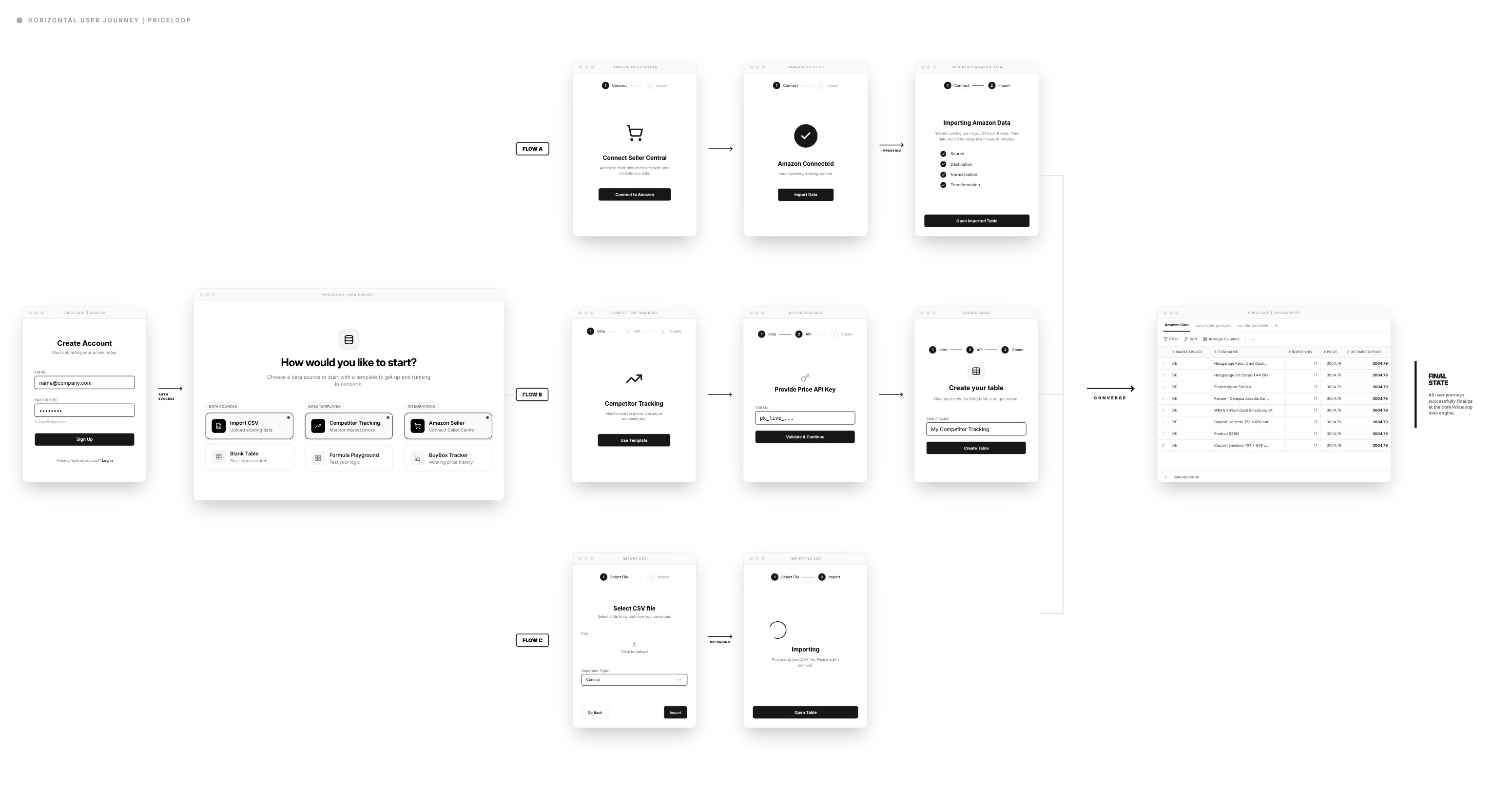
Template library: Three tests, clear winner
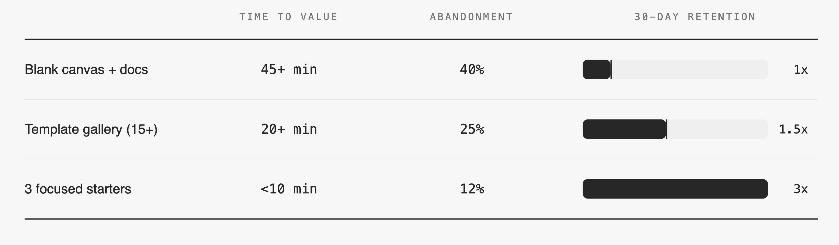
Previous implementations required days of manual setup, causing trial users to drop off before seeing value. I designed a template library where users chose their goal first ("Track Competitor Prices"). This required more upfront engineering effort and risked oversimplifying complex cases, but time-to-first meaningful action dropped to under 10 minutes, and feature adoption grew by ~25%.
Formula Editor: Spreadsheet Familiarity with ML Power
The Problem:
Users wanted both the familiarity of spreadsheet formulas and the power of ML recommendations. Existing tools forced them to choose one or the other.
My Approach:
The formula editor let users define pricing rules in familiar syntax (IF statements, conditions) while incorporating ML suggestions. This progressive complexity approach meant users could start simple and gradually adopt advanced features as confidence grew.
Why This Worked:
It met users where they were. Beginners could get started immediately, while power users had the flexibility they needed.
Result: 15 min → 3 min to first formula. 60% fewer errors.
Constraint: Parser couldn't handle full Excel complexity in v1. We limited to IF/AND/OR logic. Covered 80% of use cases. Power users got Python script escape hatch for advanced logic.
Dependency Visualization: Making ML Transparent
The Problem:
Users couldn't understand how ML-optimized prices connected to their inventory data. This opacity created distrust and prevented adoption.
My Approach:
I designed a dependency visualization panel that showed exactly how formula outputs related to input data sources. Users could trace any price recommendation back to its origin.
Design Decision:
Rather than hiding complexity, I made it explorable. The default view showed clean results, but users could drill down into dependencies whenever they needed confidence.
Trade-off:
This added visual complexity to the interface and required significant engineering effort to implement real-time dependency tracking.
Outcome:
Qualitative feedback showed this single feature dramatically improved trust. Users reported feeling "in control" for the first time when using ML-powered pricing.
The Retention Challenge
Success Metrics: Activation Solved, Retention Dropped
The template-based onboarding and transparent ML features achieved their goals:
But a few months later, retention rates dipped. The pattern was clear: once users successfully optimized pricing, many disengaged. They felt the job was "done."
The lesson was critical: everything depends on continuous value.
Compass Dashboard: Providing Ongoing Value
Based on EAP feedback I found out that users wanted insights to understand their market better. They wanted competitive intelligence, not just optimization results.
My Approach:
I designed the Compass dashboard to provide market context: competitor positioning, discount distribution, price change trends, and seasonal patterns. This addressed the discovery that users wanted to understand their competitive landscape, not optimize in isolation.
Outcome
Users who regularly checked the dashboard showed significantly higher retention rates.
Next Steps
If continuing this work, I would:
Process & Collaboration
Delivering these results required deep collaboration. I introduced design-dev pairing sessions, which dramatically reduced misalignments and sped up iteration cycles.
What I Changed:
These shifts directly improved delivery speed, quality, and team morale. Engineers felt ownership over UX decisions, and design became a team sport rather than a handoff process.
When I joined: Specs → dev → hope it matches. Misalignments led to 1-2 week rework cycles per feature.
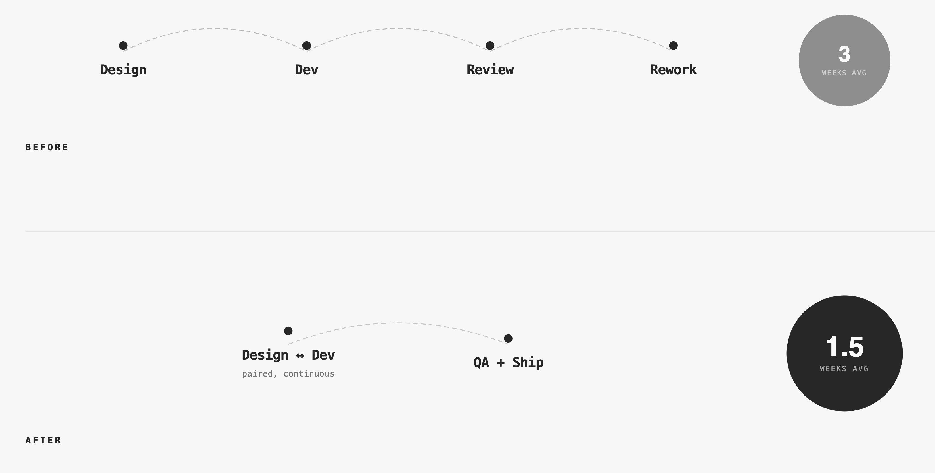
Pairing required 2 hours/week per engineer upfront. Data proved it within 2 sprints: Rework time decreased more than pairing time increased.
Reflection
Transparency builds trust in AI
Users don't need to understand algorithms, but they must understand what AI will do to their business. Showing confidence scores, dependencies, and reasoning is non-negotiable. More on how I measure trust in AI products →
Retention requires continuous value
Solving the initial problem well isn't enough. Users need ongoing insights and discovery to stay engaged. Dashboards, explanations, and visualizations aren't extras—they're core to retention.
Collaboration is a design skill
Building effective team processes improves user experience quality as much as interface design does. Design-dev pairing, shared component systems, and co-recruiting transformed how we worked.
Speed to value beats feature breadth
Focusing on core value first, then expanding, creates better products than trying to solve everything at once. The template-based onboarding proved this decisively.