Booking Software
TL;DR
Post-merger challenge: three booking platforms (Rezdy, Checkfront, Regiondo) serving 1M+ users needed to become one in 6 months. Triple operational costs, losing deals to competitors, 6-week feature cycles versus their 2 weeks.
I led design for the unified workspace where operators manage high-stakes bookings across museums, helicopter tours, and activity centers. Mid-project, I realized my Figma-first workflow couldn't match the team's AI-accelerated development pace. I shifted to prototyping in code and opening pull requests—transforming both the product and how we worked.
Results: 69% faster task completion, 67% activation (up from ~15%), zero churn, and a new design-to-code workflow that kept us on deadline.
How do you build one platform for museums, helicopter tours, and activity centers without forcing everyone into the same rigid structure?
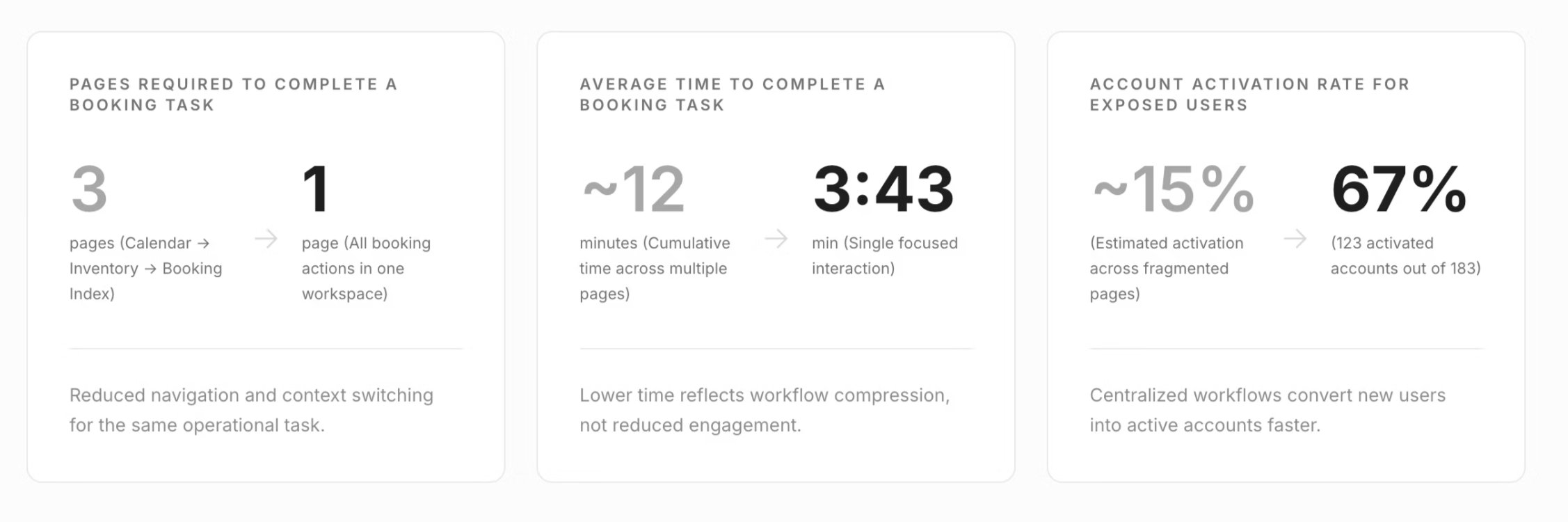
Three platforms meant three different ways to modify bookings, check in guests, and process payments. Operators spent 12 minutes on tasks that should take 3, clicking through 5-8 screens while losing context.
The operational reality operators faced daily: modifying a booking required 5-8 screens and averaged 12 minutes. They'd start in a calendar view, click to a detail page, navigate to a payment screen, return to the calendar to confirm. Losing context at every transition. Information was scattered. The cognitive load was crushing. Mistakes meant lost revenue.
Research: Speed Over Features
I embedded myself with the team to understand what operators actually needed:
The insight: Operators didn't want more features—they wanted speed.
Complete tasks in under 3 minutes without losing context or switching tools.
This reframed the strategy: Not feature parity, but operational speed.
The Core Problem: One Platform For Everyone
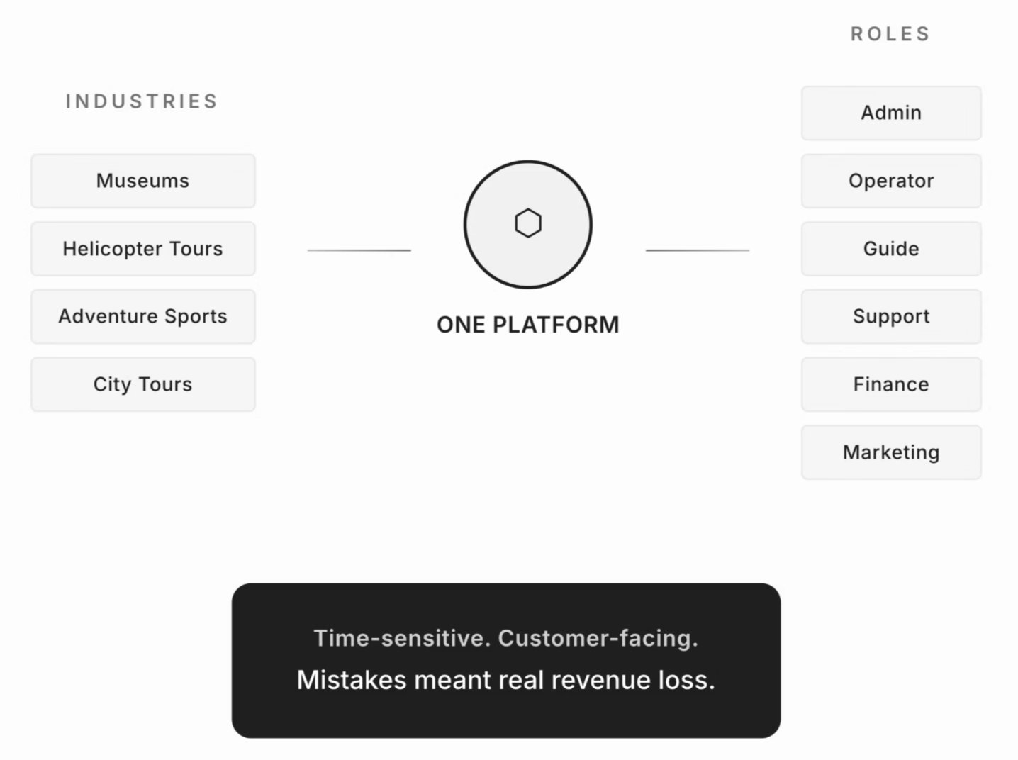
Legacy platforms forced everyone into the same view:
This created rigidity that couldn't flex to match how operators actually worked.
The question became: How do we give operators flexible views without building three separate products all over again?
Strategic Decisions
Views: Flexible Architecture, Not Prescribed Workflows
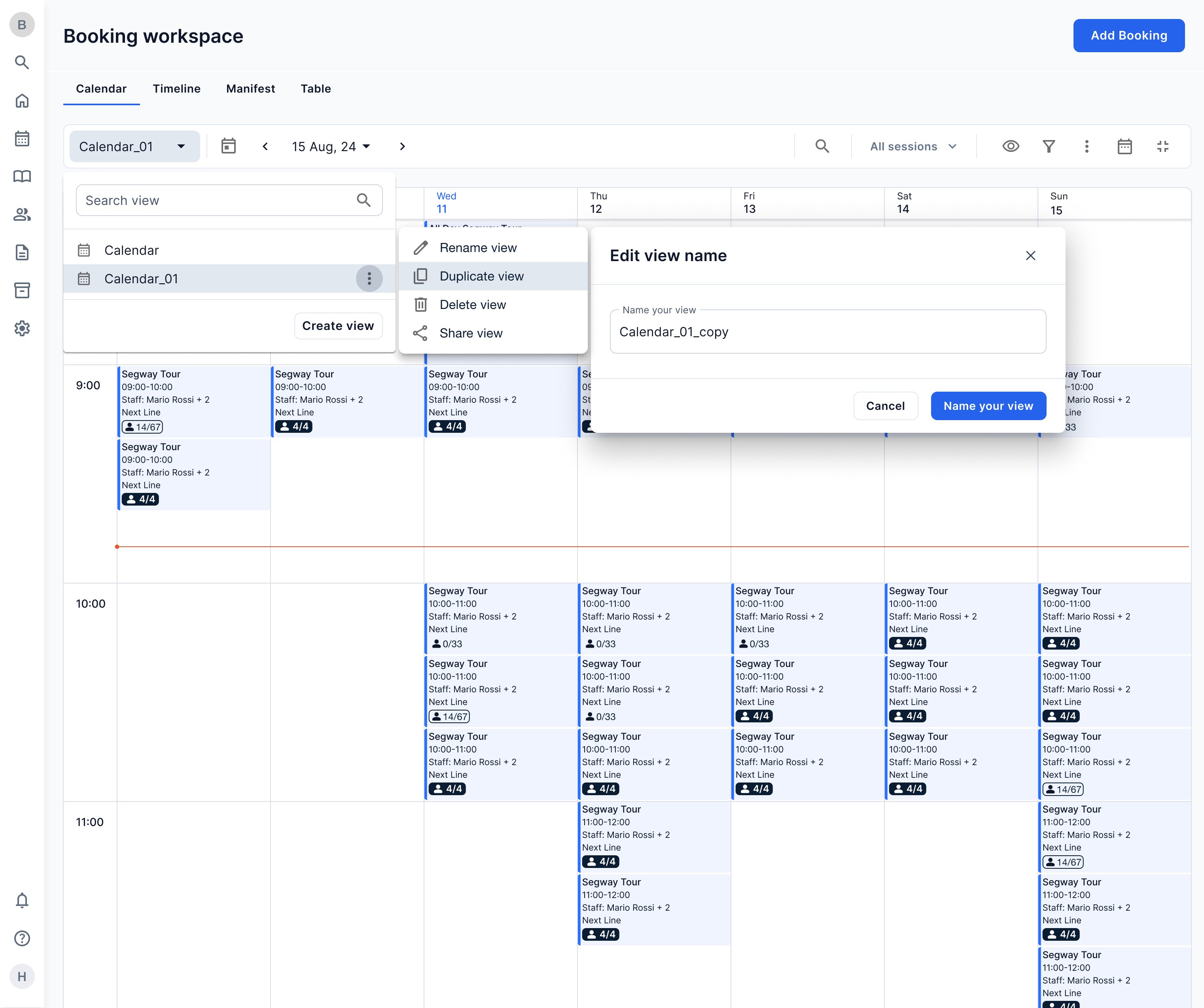
Instead of designing one "perfect" calendar, I built Views—a system where operators create perspectives matching their workflow. Museum operators filter to time slots and capacity. Tour operators filter to guides and payment status. Activity centers filter to memberships and attendance.
Each industry kept their mental model. The platform adapted to them.
Result: 78% created custom views in their first week.
Context-Preserving Drawer: Complete Tasks Without Switching Screens
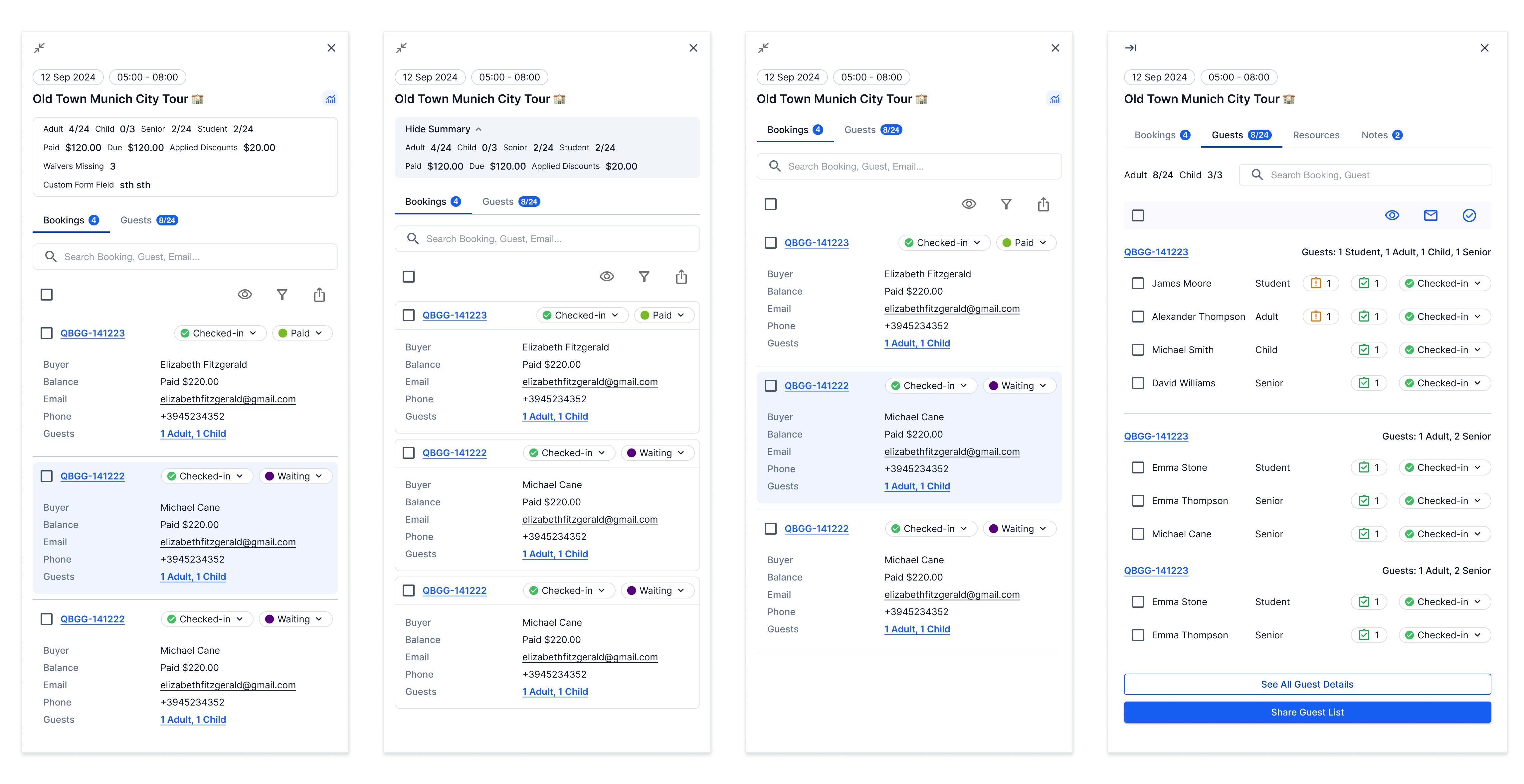
Drawer early pattern exploration
Operators needed to modify bookings, check in guests, and process payments without losing their place in the calendar. I designed an adaptable drawer—universal information at the top (status, details), contextual information below (capacity, group size, customer history), actions always accessible.
Different industries prioritize different information. The drawer flexed to match while keeping operators in one view.
Result: 60% of modifications happened through the drawer. Task time dropped from ~12 minutes to 3:43.
The Moment I Had to Let Go of "Design Process"
Team adopted AI-assisted development mid-project. Development velocity increased dramatically.
What I Did:
Results: Zero Churn, 69% Faster Tasks, and a New Way of Working
Business Outcomes
Operator efficiency: An operator handling 20 bookings per day now could save 2.7 hours daily—675 hours annually per operator.
Task simplification: Booking modifications that required 8 clicks across 3 screens now take 2 clicks in one drawer.
Feature velocity: 2-week cycles → 2 days cycles (one codebase vs three)
Process Transformation Impact
The shift from Figma handoffs to code collaboration changed how the entire team worked:
Engineers felt ownership over UX decisions
Design intent translated directly to shipped experience because I was working in the same medium, seeing the same constraints, making tradeoffs in context.