Metrics and Reporting for Conversational AI
TL;DR
The analytics dashboard was the most-used feature but had been broken for 2 years. Each workspace had different analytics, making comparison impossible. Users couldn't find key data or act on insights.
I redesigned the entire system from fragmented workspace-specific dashboards into a unified three-page structure serving three distinct user segments.
My impact: Standardized metrics across all projects. Connected analytics to actionable workflows. 60%+ analytics usage. 75%+ CSAT. NPS 65+.
Dashboard used daily but broken for 2 years—each workspace different
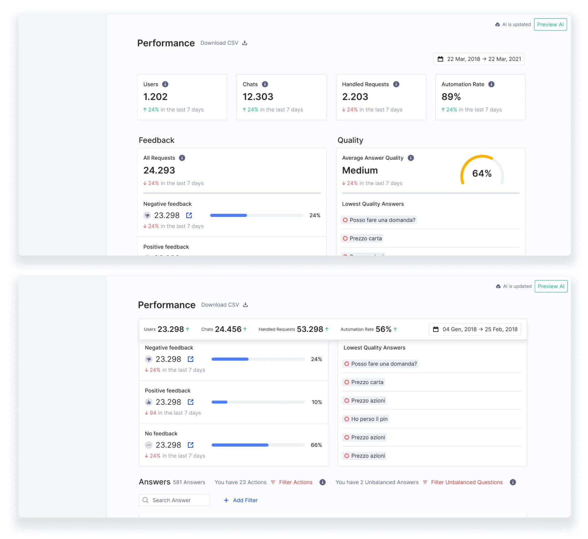
The analytics dashboard was the most frequently used feature. And it had fundamental problems that accumulated over 2 years of customer requests and band-aid fixes.
Beyond fragmentation: Unclear presets. Invisible date filters. Confusing terminology.
Two constraints shaped the redesign: We had to work with existing data infrastructure (couldn't rebuild from scratch). And we had to maintain backward compatibility—existing integrations and exports couldn't break.
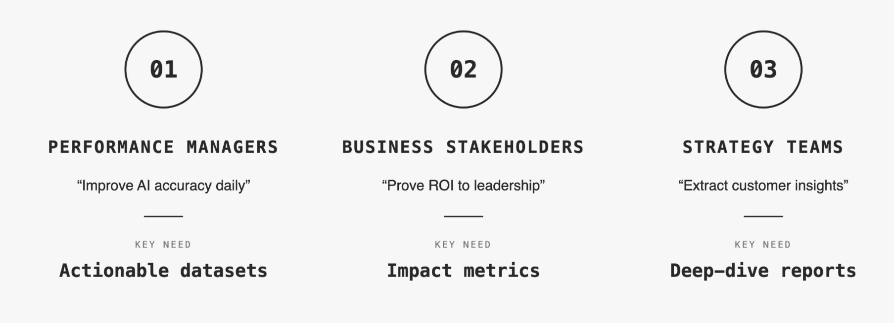
Research revealed three user segments with conflicting priorities
I compiled issues from in-depth interviews, Hotjar session recordings, and support feedback. I dedicated an entire monthly usability recap to analytics to deeply understand pain points.
Three user segments emerged, each with different goals:
Five critical pain points surfaced repeatedly:
Ran 3 workshops with 3 stakeholder groups to align on metric priority
Over 3 days, I ran separate workshops with each user segment. Same framework, different participants.
Workshop output:
Four metrics mattered to all three segments: Total conversations, AI accuracy, Operator requests, Traffic trends. These became Cardinal Metrics—always visible, standardized across all workspaces.
Beyond that, priorities diverged. Performance managers needed unanswered questions linked to Training Center. Business stakeholders needed ROI calculations for reports. Strategy teams needed export flexibility and historical comparison.
This gave me the architecture: Cardinal Metrics (top of every page) → Performance (Page 1) → Business impact (Page 2) → Deep analysis (Page 3).
Designed three-page system—each optimized for different user job
Core decision: Split analytics into three focused pages instead of cramming everything into one overwhelming dashboard.
Page 1: Business Overview—ROI metrics for stakeholder reporting
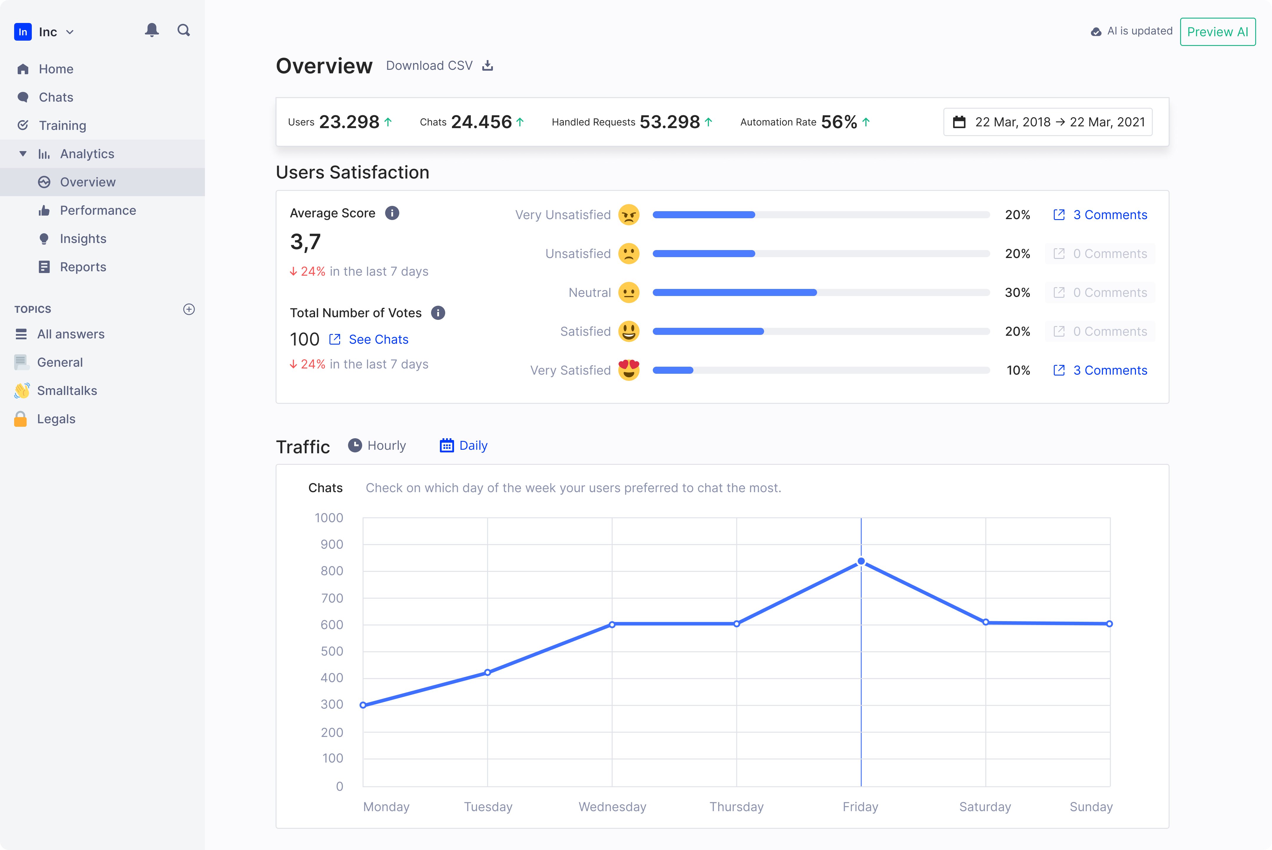
Focused on metrics that answer "is this working?" for leadership conversations.
AI Knowledge Base Score introduced—After discussions with AI researchers, we added a comprehensive performance metric. Single number (0-100) representing overall assistant quality.
This was controversial internally. Data scientists worried it oversimplified. Business stakeholders loved it—finally a number they could report.
We shipped it with clear methodology documentation. The trade-off: Sophisticated users questioned it initially, but broader adoption proved it unlocked conversations that technical metrics couldn't.
Page 2: Performance—connected analytics to action
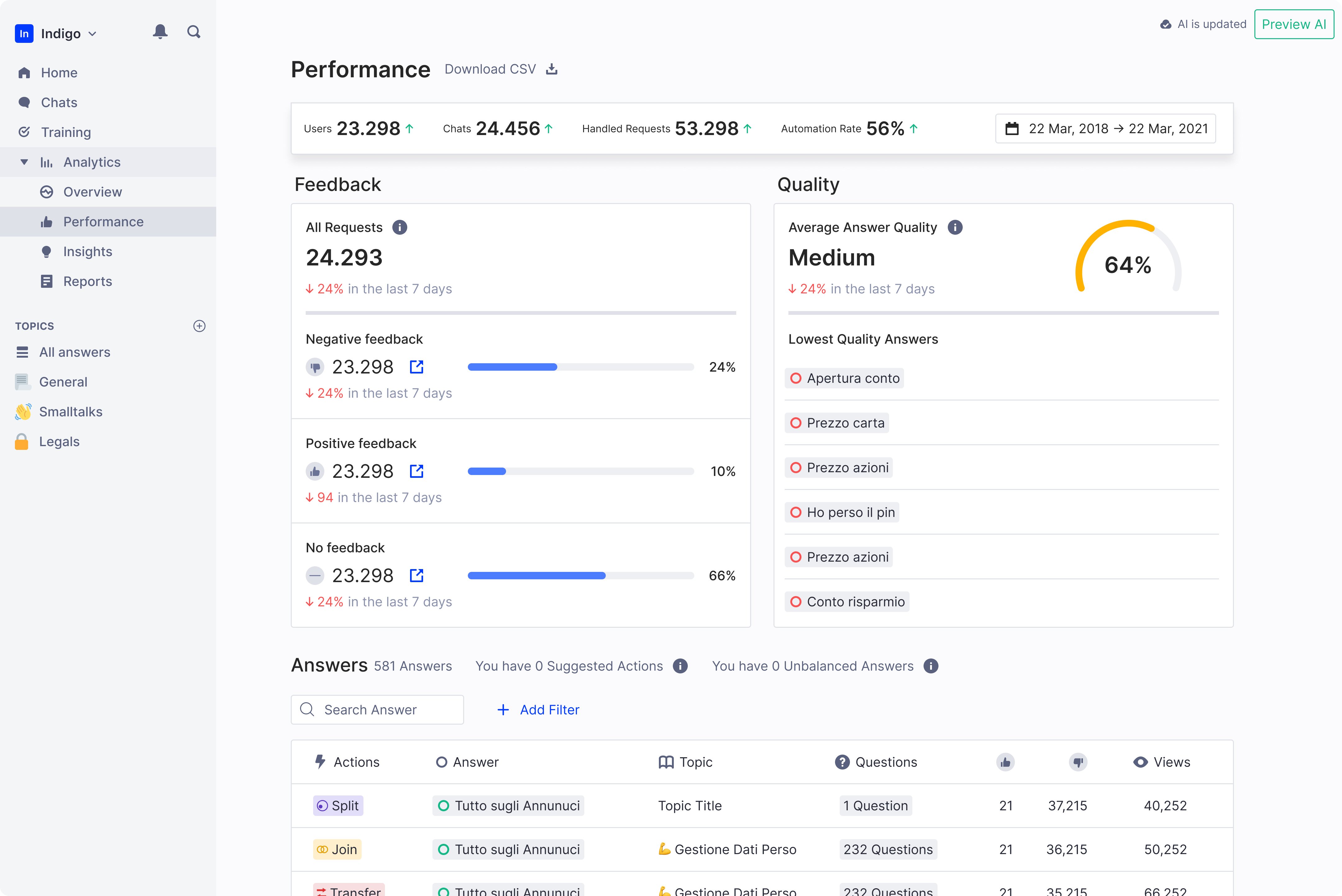
Primary dashboard for day-to-day monitoring. Every dataset linked to platform areas where users could take action.
Key design decisions:
Unanswered questions prominent and actionable—Most requested feature. Linked directly to Training Center. One click from insight to action.
Changed unit from messages to conversations—More meaningful context. Engineering resisted (more complex), but user comprehension improved significantly in testing.
Page 3: Reports—deep-dive analysis for custom needs
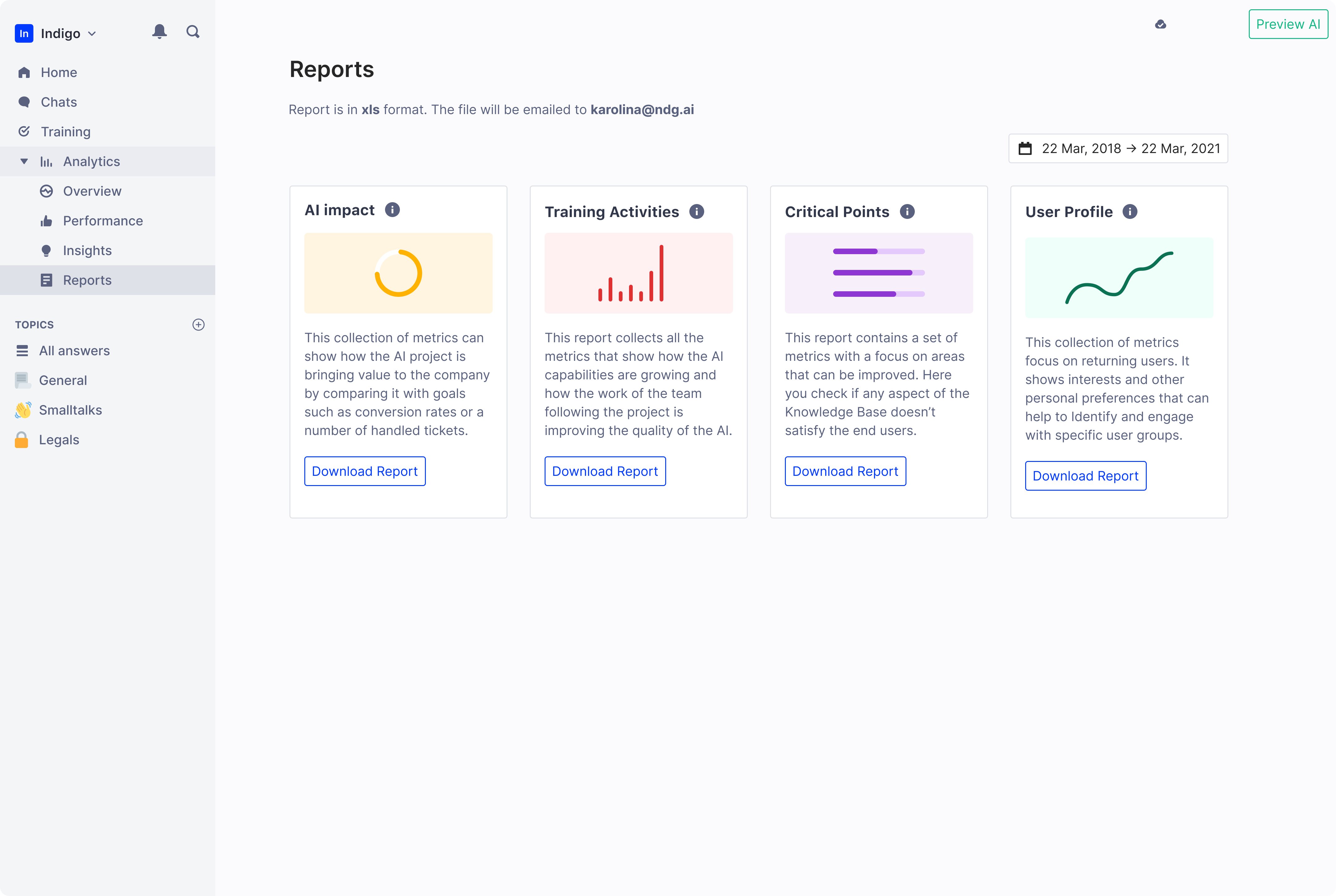
Detailed, customizable analytics. Not optimized for speed—optimized for depth.
This page absorbed metrics we removed from Performance page. Occasionally-consulted data moved here. Historical comparisons, granular breakdowns, presentation-mode charts.
Five key innovations transformed raw data into insights
1. Cardinal Metrics bar—always visible, standardized everywhere
Four metrics displayed at top of all pages. Fixed position while scrolling.
Before workshops, we had 8 metrics competing for "most important." Workshops proved only these 4 mattered to all three user segments.
2. Actionable datasets—click metrics to fix problems
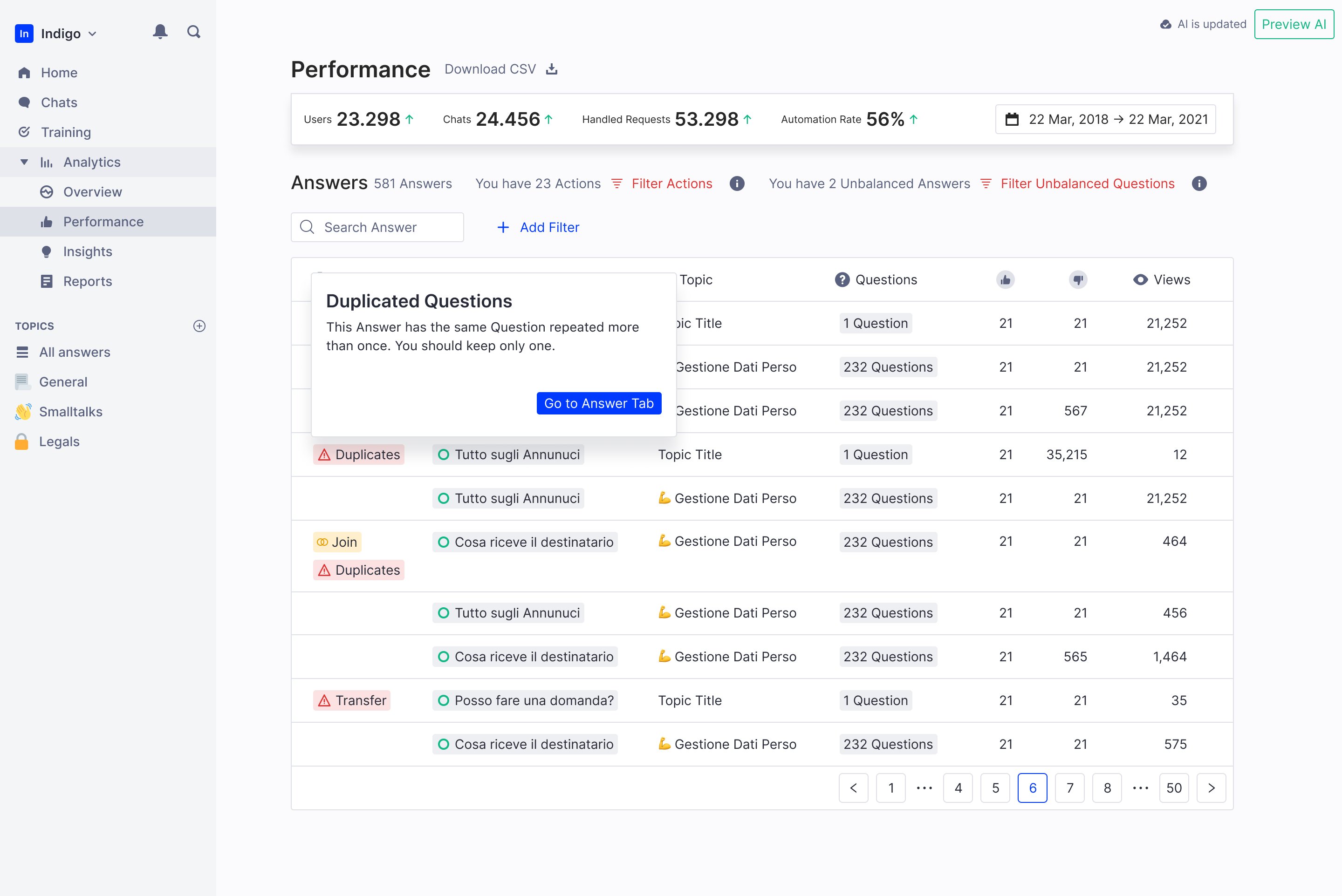
Connected analytics to action. Unanswered questions linked to Training Center. Top conversations linked to Chat History.
Engineering initially estimated 3 weeks for this. We prioritized it because research showed users who could act on insights kept using analytics.
3. Empty states with upsell opportunity
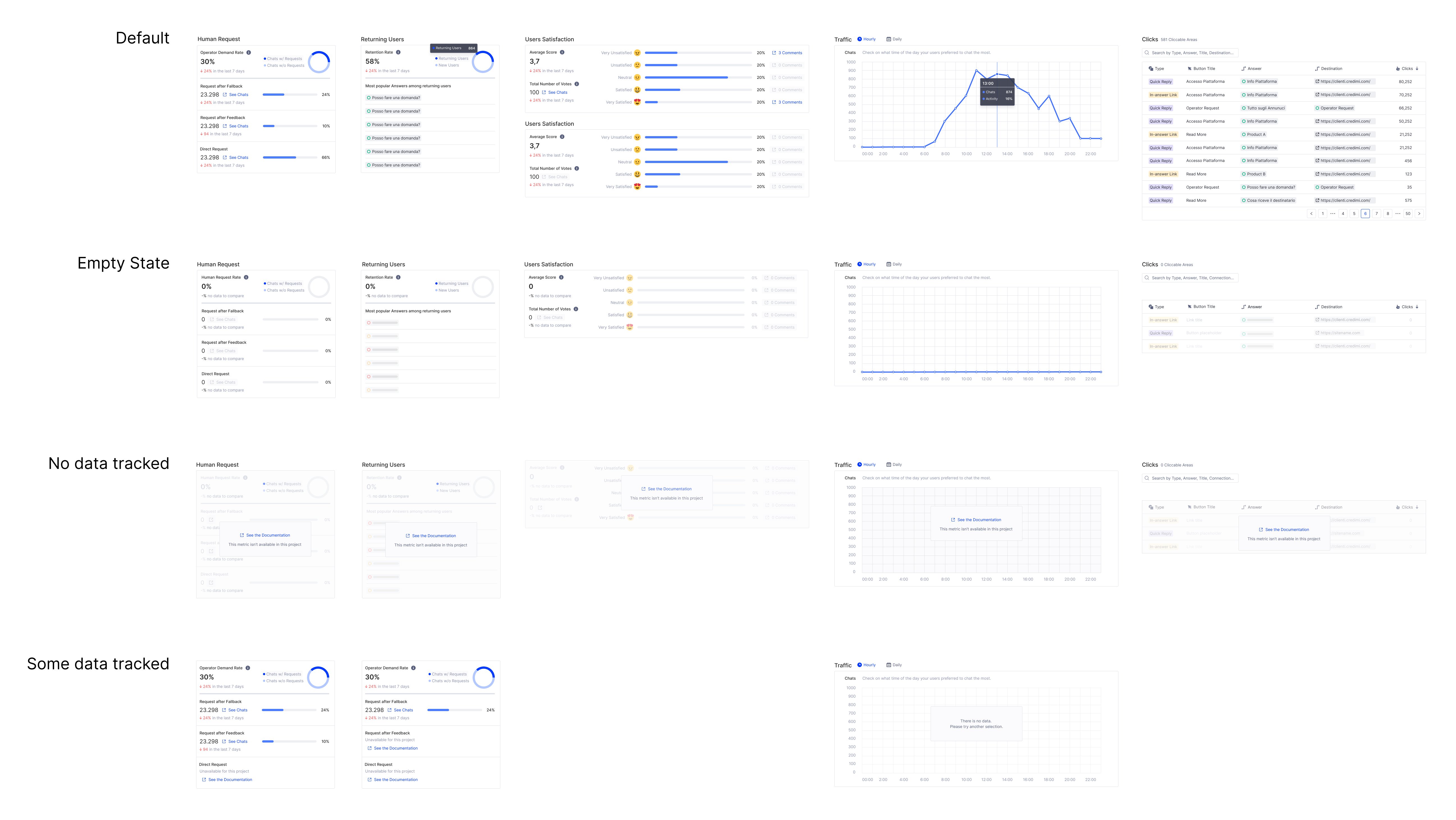
When projects don't track certain metrics, we show why and what's needed to enable them.
Unified analytics meant standardized data. Empty states explained what was missing and linked to documentation. This also created upsell opportunities—some metrics only available on higher tiers.
Standardized metrics enabled better customer conversations
+60%
Users actively use analytics
100%
Workspaces have ≥1 login
75%
CSAT from product users
65 NPS
from customers
Beyond metrics:
What's next: Foundation for predictive analytics
The redesigned analytics platform established a foundation for: