No-code Platform for Building AI Assistants
TL;DR
80% of users abandoned Verse before building their first AI assistant. 86% never created a single question. 63% never created an answer.
The platform promised "no-code AI for everyone" but the experience assumed technical fluency users didn't have.
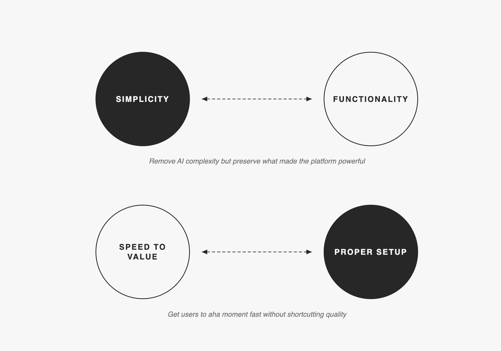
I redesigned the entire user journey around one goal: get users to their first working assistant before they gave up.
Retention increased 30%. Support questions dropped 73%. NPS hit 64 (goal was 60). 80% of active companies inserted 10+ answers.
86% of users abandoned without creating a single question
Verse let companies build AI-powered virtual assistants without writing code. The technology worked. The experience didn't.
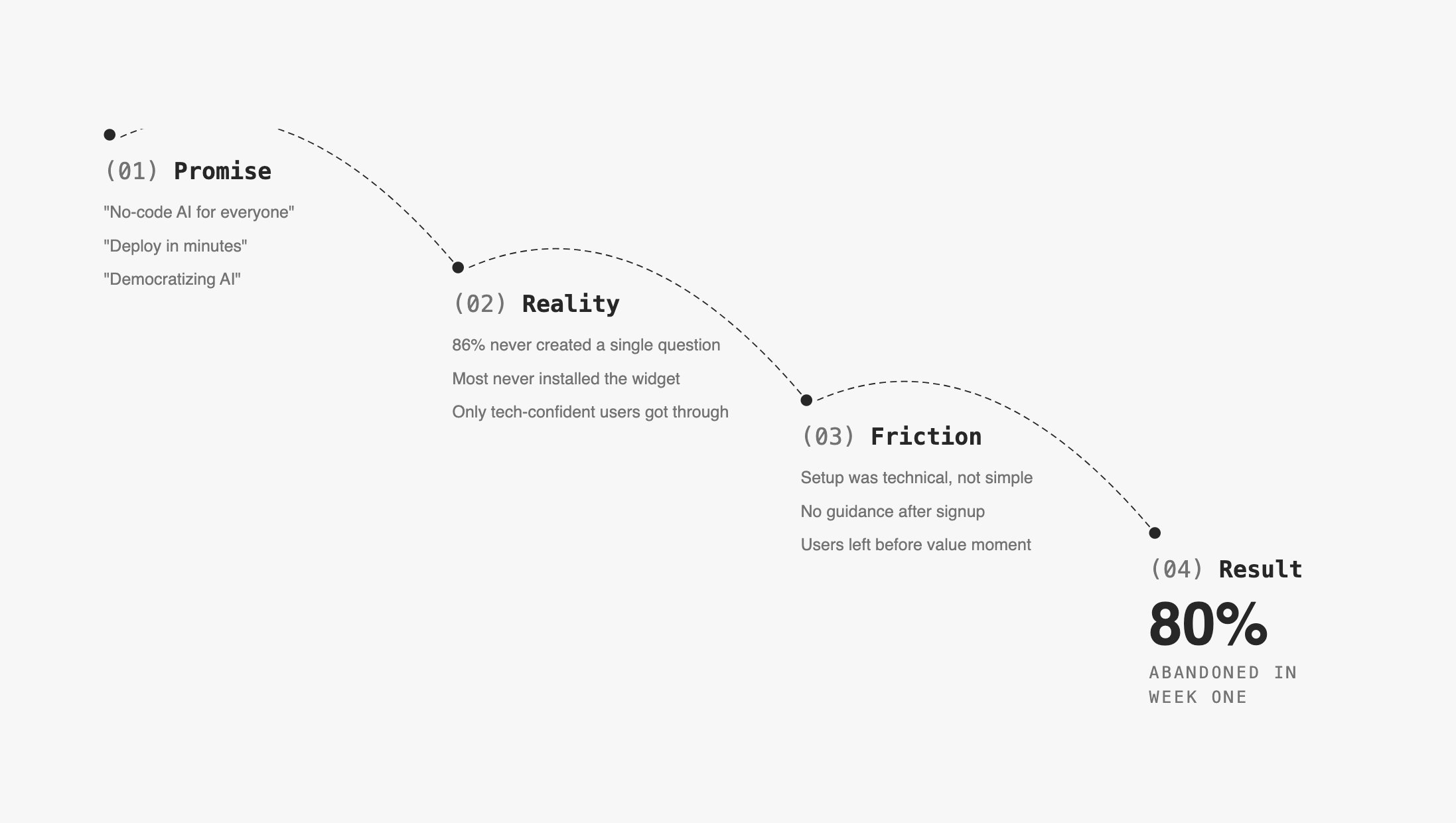
The "aha moment"—seeing the AI handle a real customer query correctly—existed and was reachable. Users just never got there.
Two constraints shaped everything
Existing architecture: We couldn't rebuild the knowledge base flow from scratch. The platform was technical by nature: users wrote Q&A pairs, trained the model, synced the assistant. Each step had to happen in order, and skipping any one broke the outcome.
The gap was invisible to the team: Nobody had watched a real user struggle with the product. Leadership believed the drop-off was a marketing problem, not a product problem.
Session data showed 63% signed up on mobile where the product was unusable
Numbers told the first part:
86%   of users never created a question
63%   of users never created an answer
70%   of users never came back after first session
18%   avg onboarding completion rate (target for healthy SaaS: 30%)
26%   onboarding completion for users who eventually went live
Critical finding: 63% of signups came from mobile. The platform was completely unusable on mobile. They signed up on their phone, hit a wall, never returned.
This wasn't a retention problem. It was an activation problem that started before users properly opened the product.
Interviews revealed three moments where users gave up
I ran in-depth interviews with Early Access Program users, moderated tests, and analyzed session recordings in Hotjar to find where hesitation turned into abandonment.
Three friction points caused week-one churn:
Empty Knowledge Base
"I don't know what to put here or how much I need before it works."
→ No scaffolding, no templates, no signal of progress

AI terminology
"Intent," "confidence score," "entity," "utterance"
→ Vocabulary assumed ML background most users didn't have
→ Created fear of doing something wrong before starting

No progress signal
→ Training button was clicked randomly—users didn't understand
  what it did or when to use it
→ Syncing the assistant with KB updates was easy to miss entirely
Two tensions shaped every decision
Getting stakeholders into user interviews moved adoption to the top of the roadmap
This was harder than the design work.
When I presented research findings through decks and reports, leadership acknowledged the problems but kept prioritizing new features like human takeover (impressive in demos, but wrong for a product 86% couldn't activate). Presentations didn't create urgency. I got the key stakeholders into live user interviews and adoption moved to the top of the roadmap the following week.
I then introduced monthly research presentations to maintain this alignment.
Designed the entire journey around the 10-answer milestone
Core decision: Design the entire journey around one milestone—10 answers in the Knowledge Base, which was the minimum needed to see the AI respond correctly to test queries.
We set measurable goals for the 6-month project:
GOAL                                                RESULT
━━━━━━━━━━━━━━━━━━━━━━━━━━━━━━━━━━━━━━━━━━━━━━━━━━━━━━━━━━━━
80% of active companies insert 10+ answers          ✓ Achieved
< 5 "how it works" questions per company            ✓ -73%
100% of EAP companies launch on their website       ✓ Achieved
≥ 3 user-requested features shipped                 ✓ Achieved
NPS ≥ 60                                            ✓ NPS of 64
I also mapped three stages of retention and designed for each separately:
WEEK 1:    Get users to use Verse more than, invite collaborators
WEEKS 2-4: Identify a pattern of usage—what they return for
WEEKS 5+:  Establish when Verse becomes indispensable
Most of the design work focused on Week 1. Everything else was secondary until first activation worked.
Five changes that moved users from 0 to 10 answers faster
Mobile targeting changes cut non-business signups by 70%
Rather than building mobile parity or showing warnings users dismissed, I repositioned the product itself: changed homepage to "AI assistants for your organization," removed consumer-focused ad keywords, moved data collection before workspace creation, and added Magic Link for desktop continuation
We also sent re-activation emails at 24 hours, 3 days, and 14 days. Personalized content outperformed generic feature lists on every open and click metric.
Personalized onboarding increased 10+ answer completion to 80%
Original onboarding was identical for everyone. I tested three approaches:
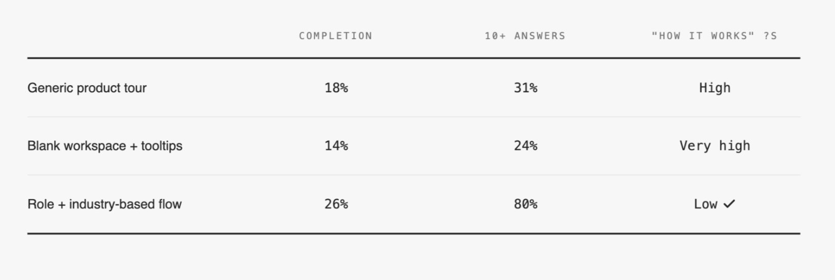
Collecting three pieces of information—role, industry, team size—unlocked personalized templates and relevant email sequences. Users reaching 10 answers jumped from 31% to 80%.
Homepage adapted to learning styles and user progress
I redesigned the homepage around visible stages: Getting familiar, Create and teach, Install widget. The interface adapted to user maturity—new users saw "Get started," users with 10+ answers saw "Improve KB," users with live assistants saw optimization guidance. Added direct shortcuts to help resources and the internal assistant to reduce context-switching.
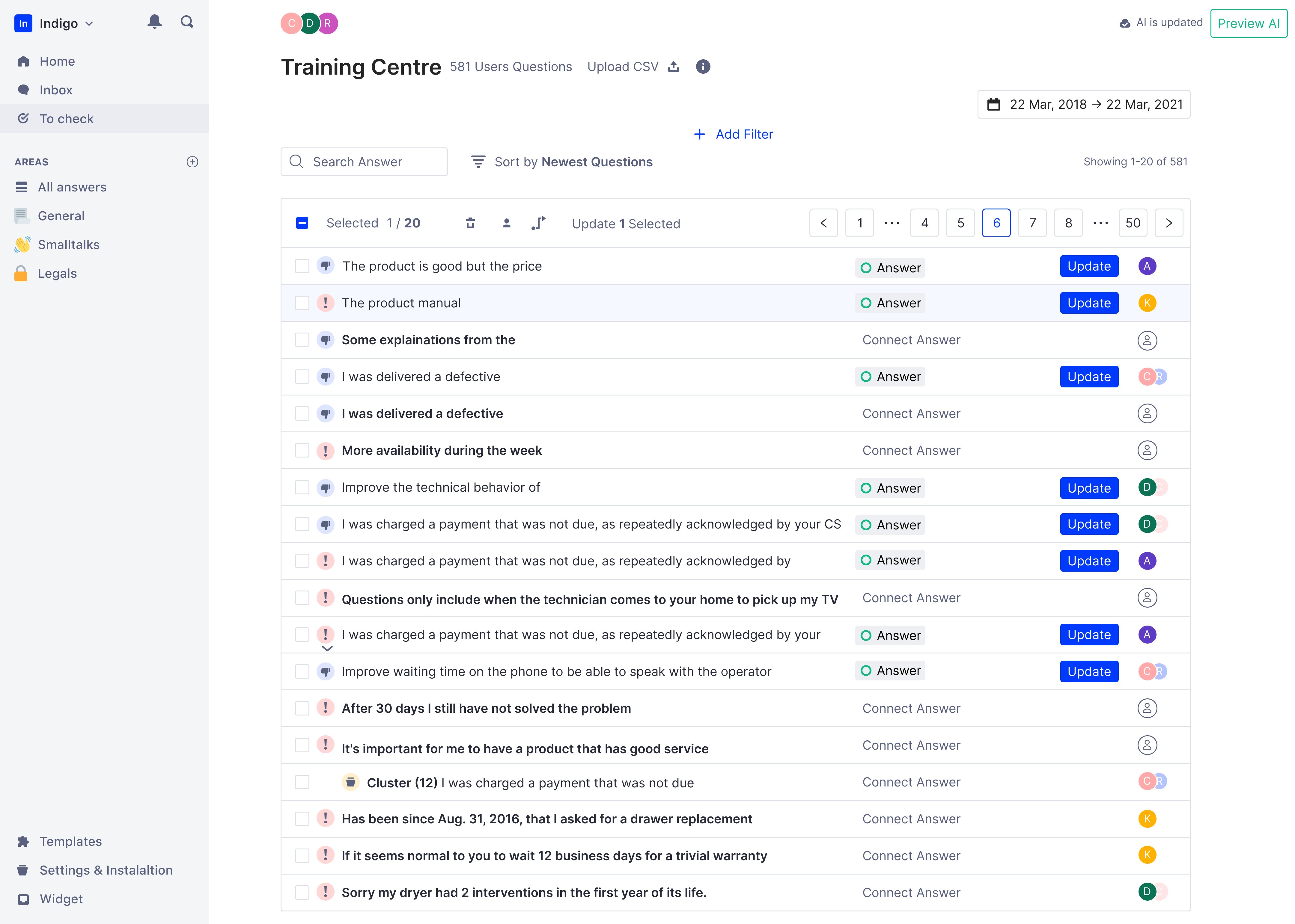
Merged tabs into single view, eliminated cognitive split
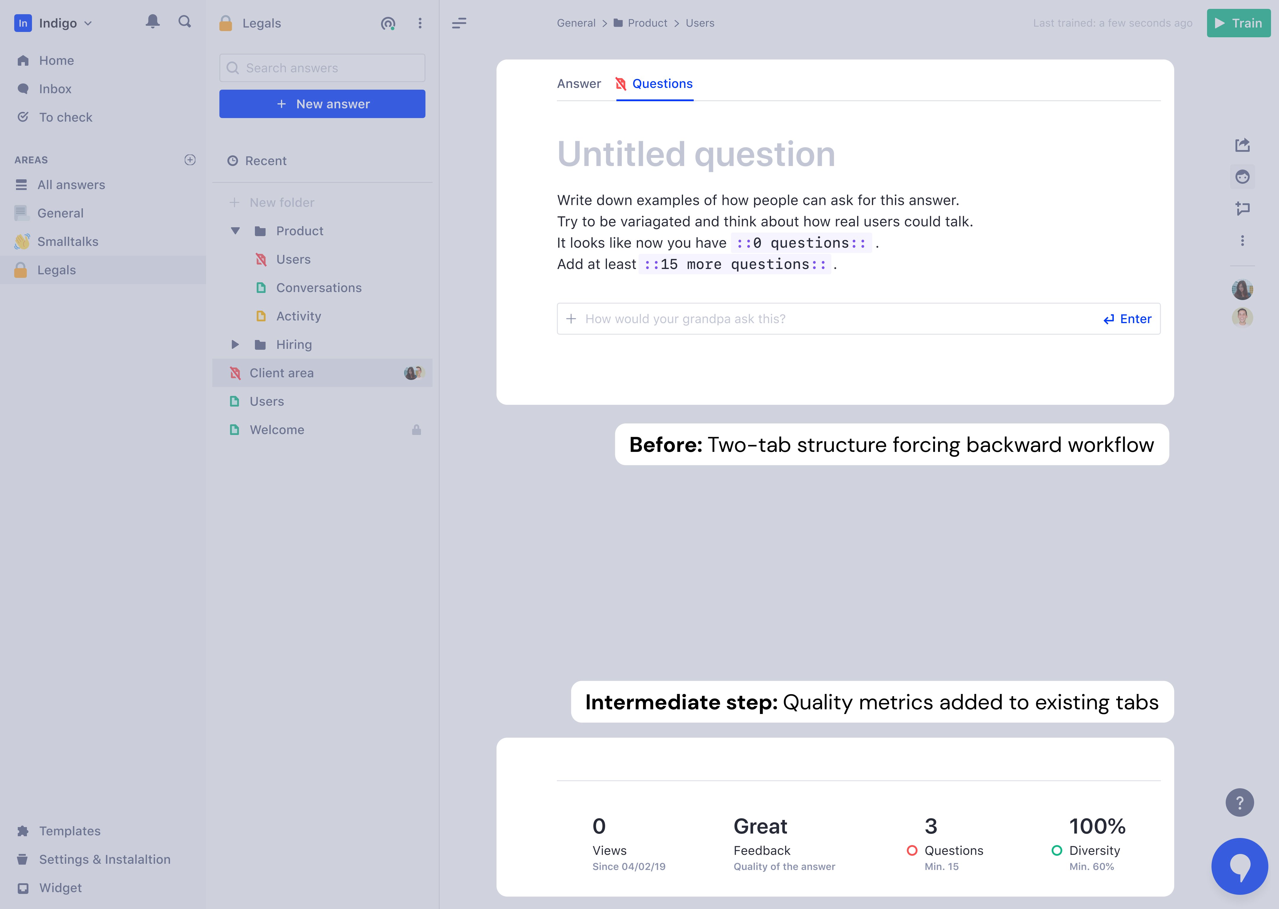
Content creation was split across two tabs: "Answer" and "Questions." Users naturally thought in FAQ format (question first, then answer), but the platform forced them backward—write answer, switch tabs, add questions. This created cognitive load that caused some users to abandon entirely.
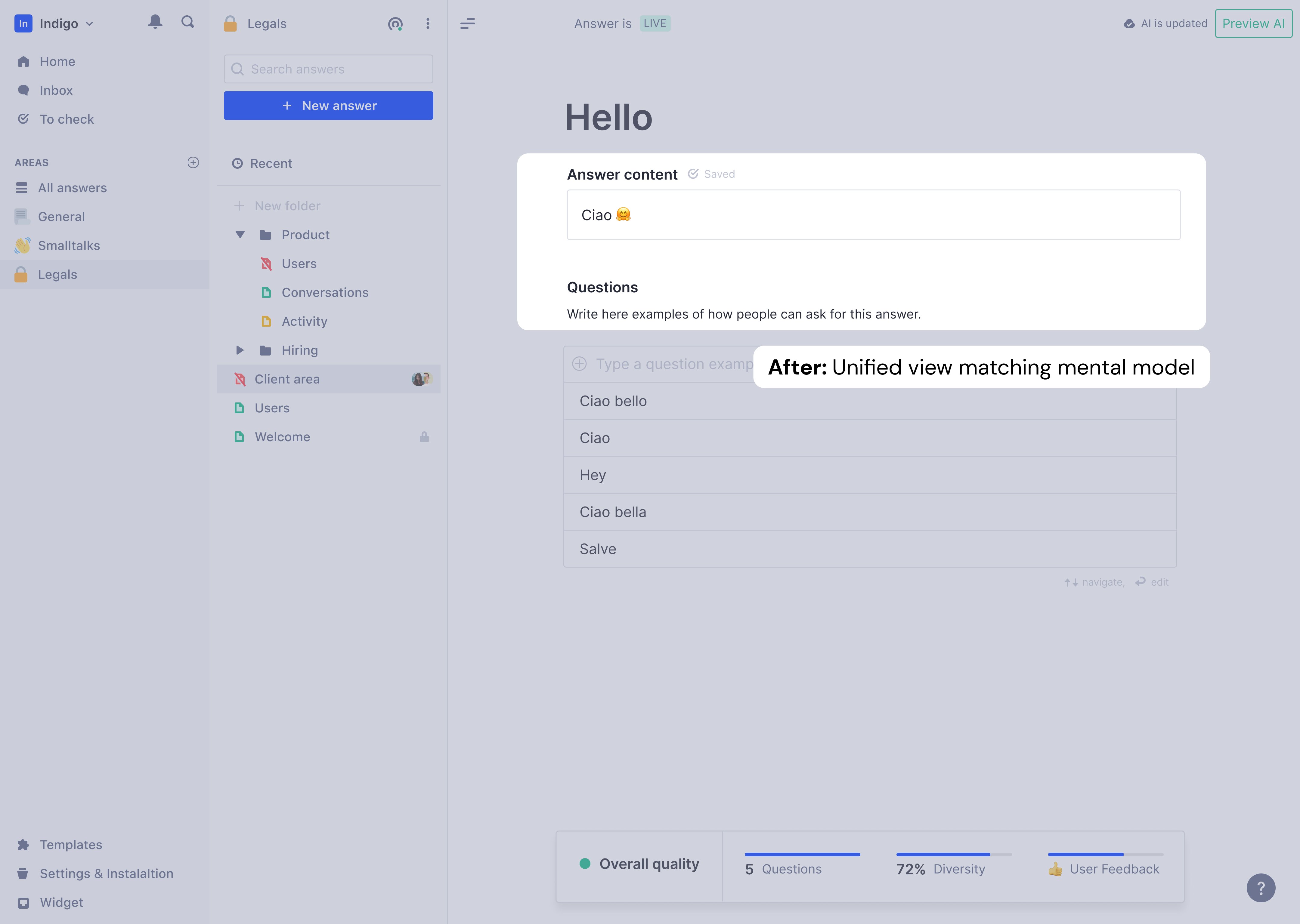
I merged the tabs into a single view: answer at top, questions directly below. Users wrote a question, saw it connect to an answer, added variations, and immediately understood how the assistant would behave. Mental model finally matched interface.
Rich content: Static text → dynamic conversations
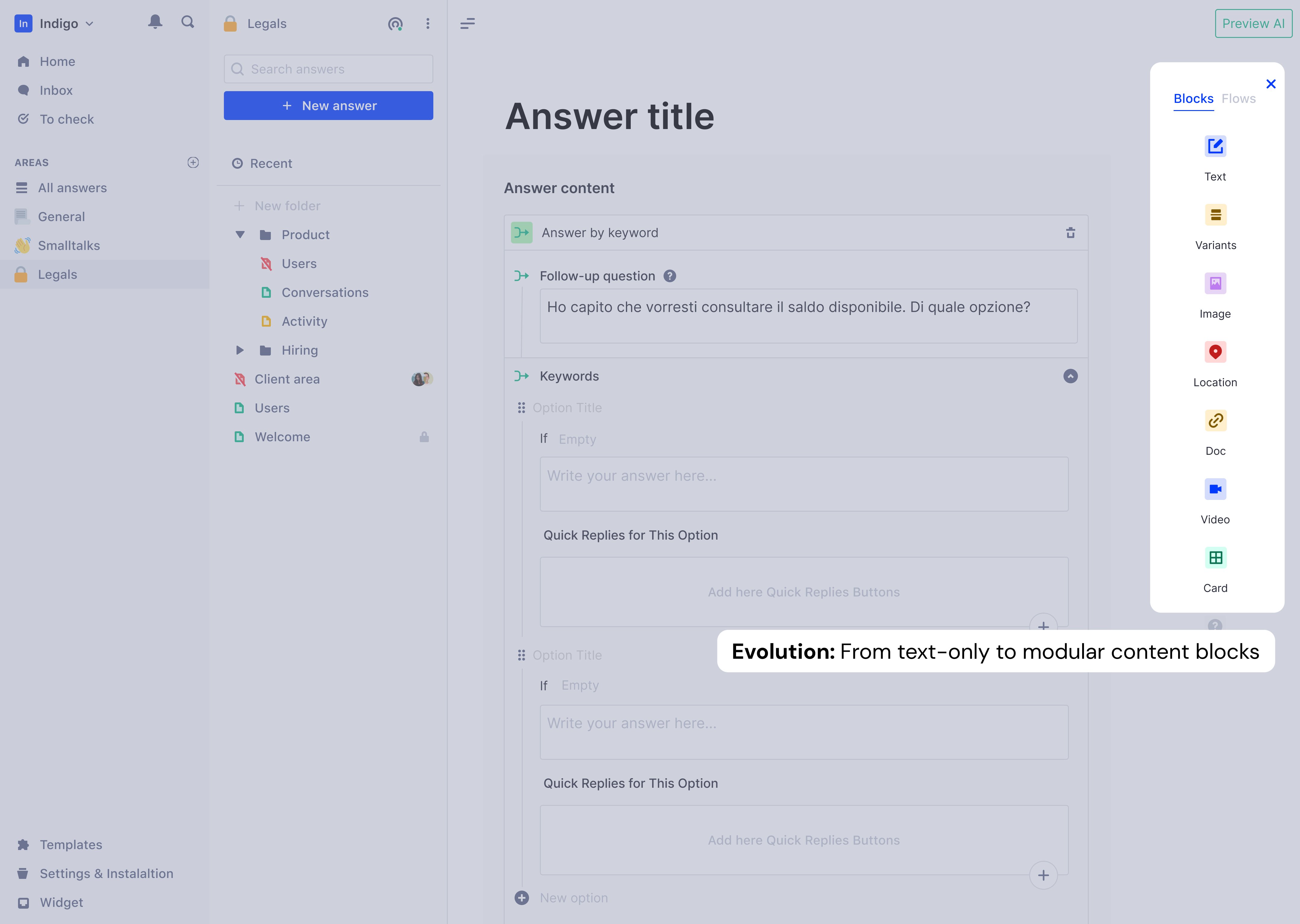
Once the unified tabs proved stable, I expanded what answers could contain: images, documents, location links, and most significantly, Quick Replies—button interactions that guided conversations forward. Quick Replies could navigate to another answer, link to products, or open external URLs.
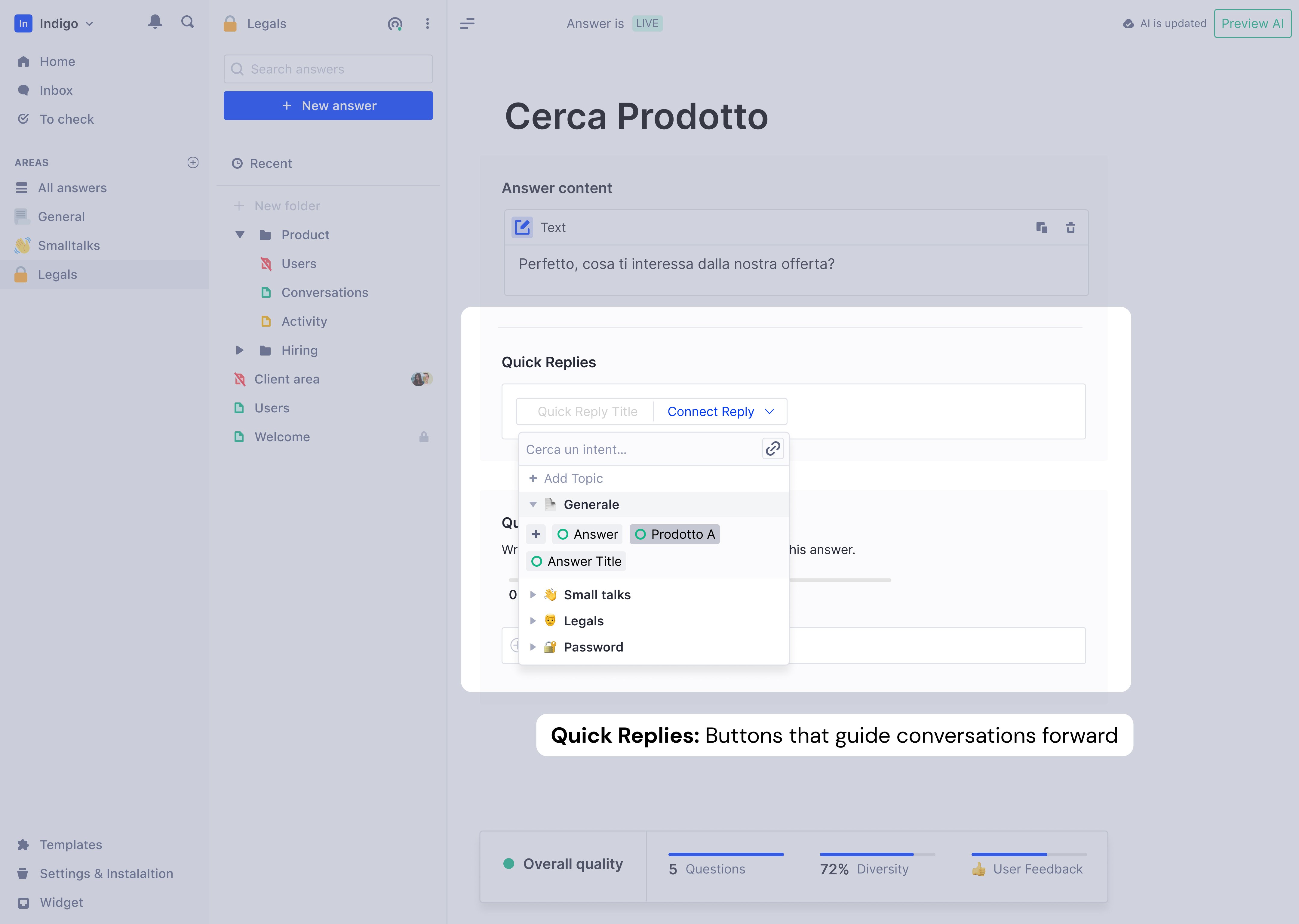
The platform transformed from FAQ storage to intelligent conversation builder.
Clusters: Bulk labeling for enterprise scale
Enterprise users with thousands of Q&A pairs faced new problem: semantically identical questions scattered across pages. Labeling one-by-one was slow.
I designed Clusters to group similar questions automatically for bulk labeling.
Key design decisions:
DECISION: Manual "Create Cluster" button, not automatic
Reason: Automatic clustering created pagination chaos
        when clusters updated mid-session
        Also: showing the cluster creation in demos was
        more impactful than invisible background processing

DECISION: Biggest clusters appear at top of table
Reason: Prioritize the chunks that grow the KB fastest
        Users who tackle clusters first reach better KB
        diversity in less time

DECISION: Filters not applied inside clusters
Reason: Unpacking clusters to apply filters would destroy
        the efficiency gain clusters were built to create

DECISION: Assignee inheritance based on majority ownership
Reason: Scale projects merge phrases from multiple collaborators
KPIs the feature targeted:
This wasn't a core onboarding feature—it was a depth feature that kept enterprise users engaged past the activation milestone.
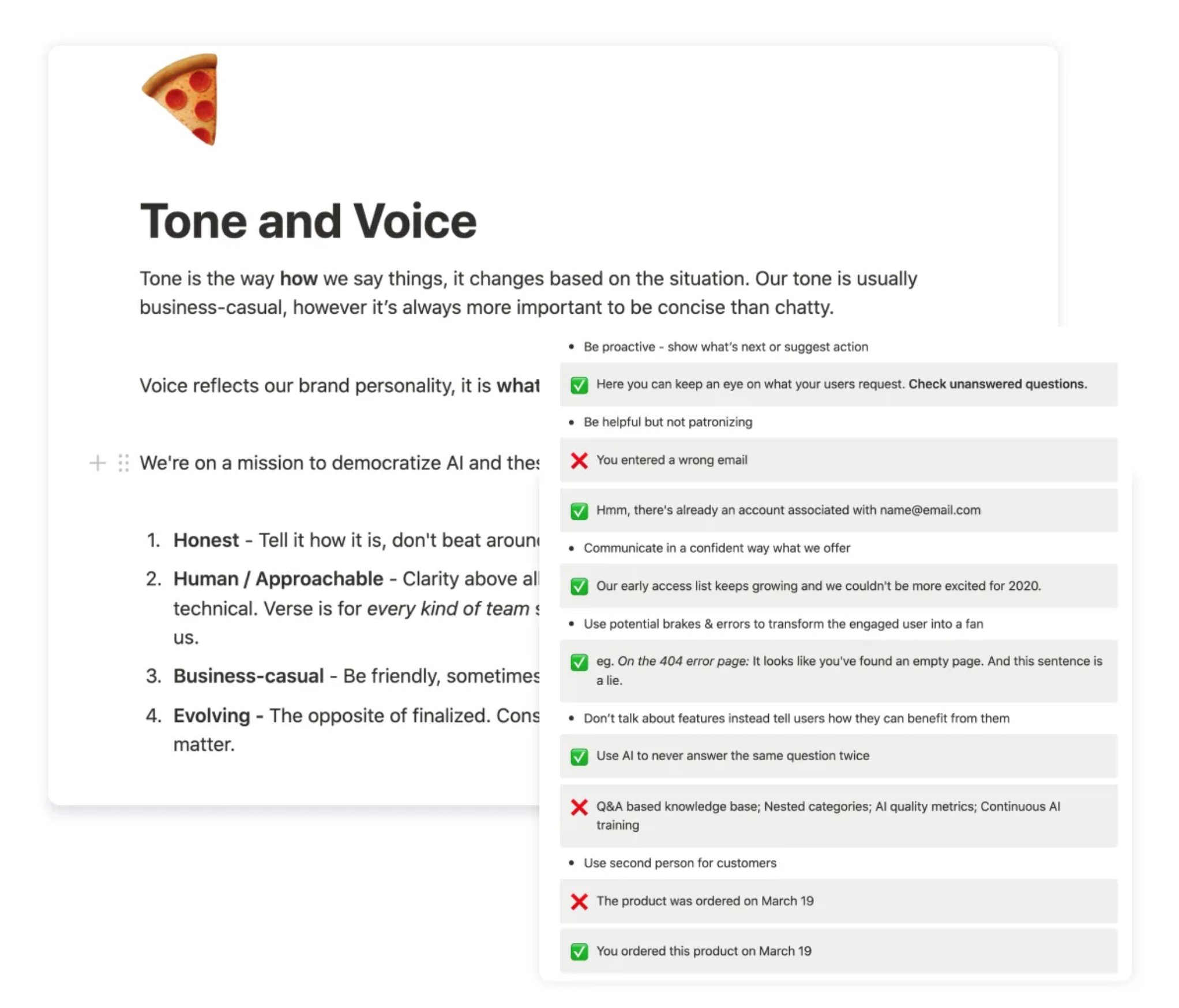
Terminology: Replaced AI jargon
Every AI term was an opportunity to confuse or clarify (""Entity, intent", "Confidence Score", "Train your model") I created Tone & Voice Guidelines and ran a workshop to align the whole team. If conversational AI doesn't start from plain language, the product contradicts its own promise.
Result: 73% reduction in "how it works" support questions. That drop came from copy and UX changes.
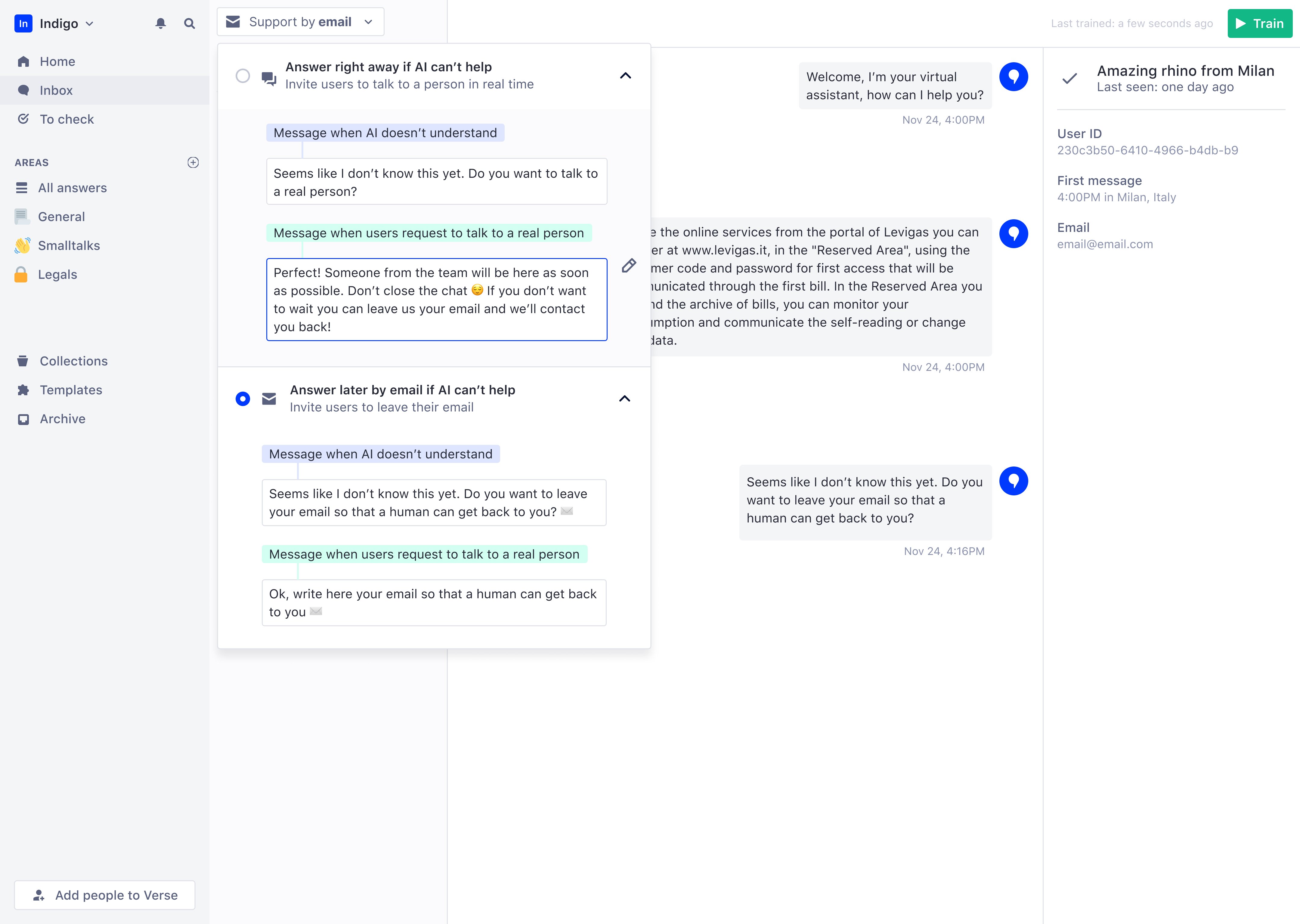
What we deliberately didn't build
Deferred human takeover feature to fix activation first—designs were ready but 86% couldn't use core product
Human takeover was the hardest deferral. Designs were ready, leadership wanted it, and it would genuinely help enterprise customers. But when 86% abandon during onboarding, adding features for the 14% who activate is premature optimization.
Impact
+30%
User retention (was: 80% abandoned in first week)
80%
Of active companies inserted 10+ answers (was: most left before this)
-73%
“how it works” support questions
NPS 64
100% of EAP companies launched their AI assistant
What users said after the redesign:
"The process of creating the Knowledge Base is very intuitive."
"The 'To Check' feature is very functional—it's great to see the suggestions given by the system."
"I like having the help centre at my fingertips."
Most telling: users started sending feature requests. That shift indicated real engagement. Users only ask for more when they've found value in what exists.
Established continuous research and testing practices
I established a testing structure that became permanent practice: high-fidelity prototypes before development, internal pilots, moderated user sessions, and iteration before sign-off. Every major feature went through this cycle. When engineers watched users struggle with their features, they cared differently about fixing them. This created shared accountability for user success, not just feature delivery.
I introduced monthly research presentations with live session clips and built a complete design system with WCAG AA standards to reduce handoff ambiguity. Most significantly, the company shifted from "what should we build next?" to "where are users stuck and what's the cost?". A mindset change that outlasted my specific contributions.
Retrospective: Build richer templates, not billing flows
I designed complete billing, subscription, and offboarding flows that would have been better handled manually. That time would have been better spent on larger, richer industry templates—e-commerce, education, financial services, healthcare.
Fix broken paths before adding new ones When 86% fail the existing journey, new features give churning users more to be confused by.
Push to include leadership in user sessions earlier It was one of the highest-leverage things I did on the project. Doing it earlier would have shortened the debate about human takeover vs. onboarding